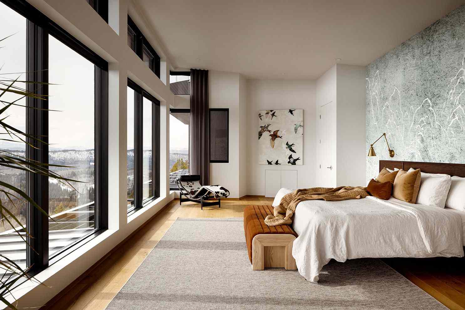
Find colors that feel right in your light, with your furnishings, and across your home. We help you build a palette that feels cohesive and easy to live with.
How color shapes mood, comfort, and the feel of a room
Reds, oranges, and yellows add warmth and energy—great for gathering spaces and lively rooms.
Blues, greens, and purples create calm and focus—ideal for bedrooms, baths, and offices.
Neutrals create balance and flexibility, giving you a timeless foundation for layers of texture and contrast.
Color guidance that works for one room or the whole home
Create an intentional flow from room to room with a palette that feels connected, not copy-paste.
Refresh one space with a palette that complements your furnishings and supports how you use the room.
Resolve “something feels off” color issues and bring harmony to spaces that feel disjointed or too busy.
Preview options before you paint with digital mockups that help you choose with confidence.
Choose the level of support that matches your project
One-room color direction
Multi-room coordination
Deep-dive color strategy
A few palettes we’re seeing everywhere this year
Rich browns and terracotta add warmth and a grounded, lived-in feel.
Deep greens bring an organic feel and make rooms feel calm and collected.
Soft, calming blues create a relaxed, spa-like atmosphere.
Creamy neutrals keep spaces bright while still feeling warm.
We’ll help you choose shades that work in your lighting and coordinate across your home.